Official Identity Kit · Internal Preview
The Callaghan Series Brand Guide
Logo & wordmark specifications, where to use each mark, and the core color palette. Use the switch below (or the sun/moon in the header) to preview every mark on the live site background in light and dark mode.
Live site background · LightDark

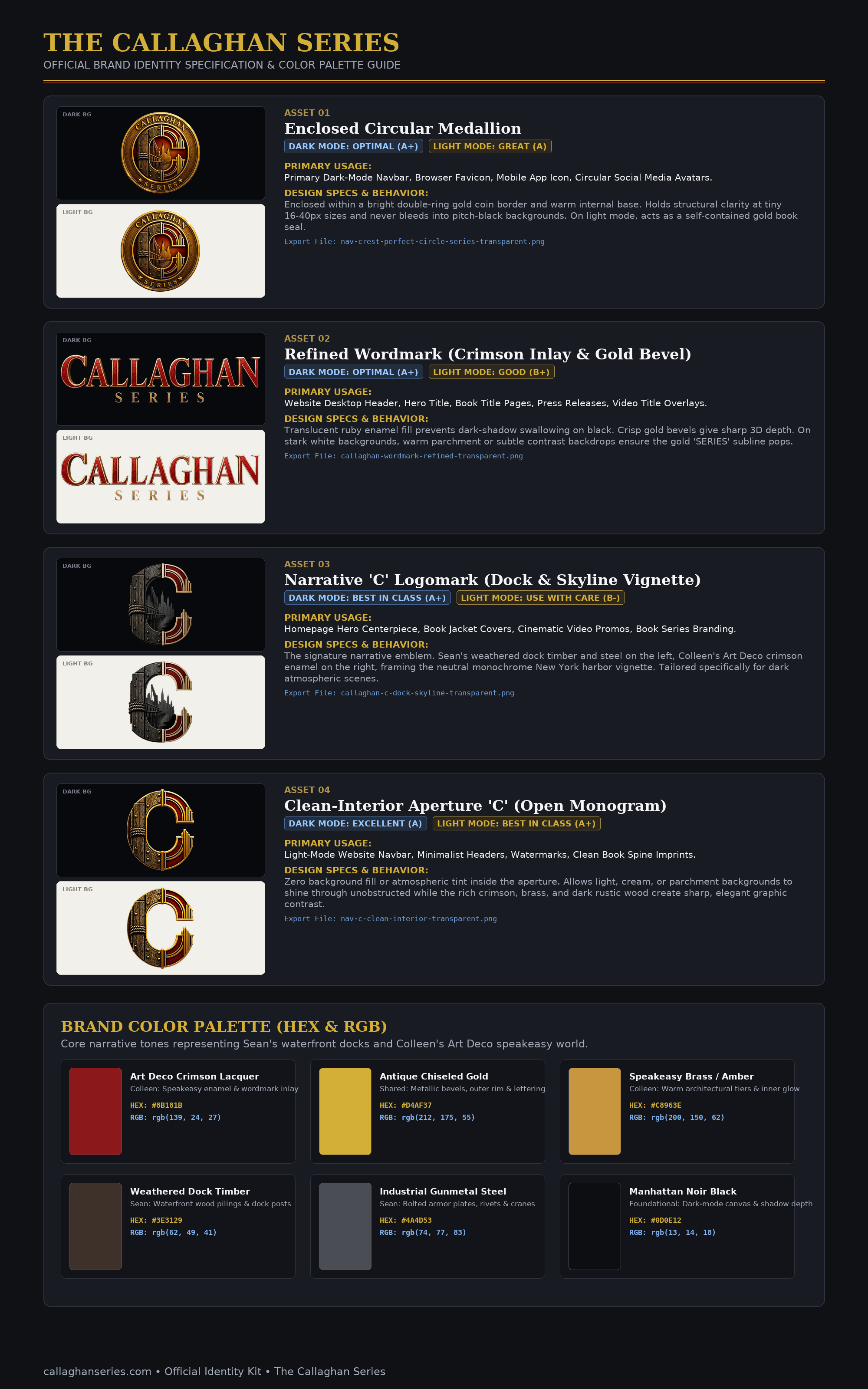
Asset 01
Enclosed Circular Medallion
Primary Usage
Primary dark-mode navbar, browser favicon, mobile app icon, circular social media avatars.
Design Specs & Behavior
Enclosed within a bright double-ring gold coin border and warm internal base. Holds structural clarity at tiny 16–40px sizes and never bleeds into pitch-black backgrounds. On light mode, acts as a self-contained gold book seal.
Export file: nav-crest-perfect-circle-series-transparent.png
Live site background · LightDark

Asset 02
Refined Wordmark (Crimson Inlay & Gold Bevel)
Primary Usage
Website desktop header, hero title, book title pages, press releases, video title overlays.
Design Specs & Behavior
Translucent ruby enamel fill prevents dark-shadow swallowing on black. Crisp gold bevels give sharp 3D depth. On stark white backgrounds, warm parchment or subtle contrast backdrops ensure the gold “SERIES” subline pops.
Export file: callaghan-wordmark-refined-transparent.png
Live site background · LightDark

Asset 03
Narrative ‘C’ Logomark (Dock & Skyline Vignette)
Primary Usage
Homepage hero centerpiece, book jacket covers, cinematic video promos, book series branding.
Design Specs & Behavior
The signature narrative emblem. Sean’s weathered dock timber and steel on the left, Colleen’s Art Deco crimson enamel on the right, framing the neutral monochrome New York harbor vignette. Tailored specifically for dark atmospheric scenes.
Export file: callaghan-c-dock-skyline-transparent.png
Live site background · LightDark

Asset 04
Clean-Interior Aperture ‘C’ (Open Monogram)
Primary Usage
Light-mode website navbar, minimalist headers, watermarks, clean book spine imprints.
Design Specs & Behavior
Zero background fill or atmospheric tint inside the aperture. Allows light, cream, or parchment backgrounds to shine through unobstructed while the rich crimson, brass, and dark rustic wood create sharp, elegant graphic contrast.
Export file: nav-c-clean-interior-transparent.png
Hex & RGB
Brand Color Palette
Core narrative tones representing Sean’s waterfront docks and Colleen’s Art Deco speakeasy world.
Art Deco Crimson Lacquer
Colleen: speakeasy enamel & wordmark inlay
HEX: #8B181B
RGB: rgb(139, 24, 27)
Antique Chiseled Gold
Shared: metallic bevels, outer rim & lettering
HEX: #D4AF37
RGB: rgb(212, 175, 55)
Speakeasy Brass / Amber
Colleen: warm architectural tiers & inner glow
HEX: #C8963E
RGB: rgb(200, 150, 62)
Weathered Dock Timber
Sean: waterfront wood pilings & dock posts
HEX: #3E3129
RGB: rgb(62, 49, 41)
Industrial Gunmetal Steel
Sean: bolted armor plates, rivets & cranes
HEX: #4A4D53
RGB: rgb(74, 77, 83)
Manhattan Noir Black
Foundational: dark-mode canvas & shadow depth
HEX: #0D0E12
RGB: rgb(13, 14, 18)
For the Website
Website Style Guide
How the brand is applied on this site. Every text color meets WCAG AA contrast (4.5:1) in both light and dark mode.
Typography
Headings: Playfair Display. Body and interface: Inter.
Page title (H1)
Playfair Display · 36px mobile → 48px desktop
Fiercely Loyal
Section title (H2)
Playfair Display · 30 → 36 → 48px
Join the Reader List
Subsection title (H3)
Playfair Display · 30px
King of the Waterfront
Card title
Playfair Display · 20px
Loyalty & Betrayal
Body text
Inter · 16px · relaxed line height
Forged in a harsh New York orphanage, Sean and Colleen grow up with nothing but each other.
Tagline / quote
Playfair or Inter italic · quote color
Where the Streets Draw Blood
Secondary & meta
Inter · 14px (buttons, reviews, captions)
5.0 · Amazon & Goodreads · 418 pages
Eyebrow / label
Inter · 12px · uppercase · 0.25em tracking · gold
What Readers Say
Interface Colors
Light-mode and dark-mode values used by the site.
Page background
Cream in light mode, Manhattan Noir in dark mode
Main text
Headings and emphasized text
Body text
Paragraphs and descriptions
Gold text
Eyebrows, links, highlighted phrases (deeper gold on cream for contrast)
Crimson text
“Loyal” accent and quotes (lifted crimson on dark for contrast)
Button gold
Primary buttons, stars, gold rules — with dark text #141018
Buttons & Components
Primary (gold). Buying and main actions. Hover inverts to dark with gold text.
Release (crimson). Upcoming-book actions only. Hover inverts to dark with red text.
Secondary (soft gold). Read more, reviews and other supporting links.
Tags & badges. Gold-tint genre pills; crimson badge for unreleased books.
Imagery
Book covers always appear as standing 3D books, and their thickness follows the page count: Fiercely Loyal (418 pages) is shown about twice as thick as Fiercely Hunted. Text over photos always sits on a dark overlay. Author portraits use a dark backdrop with a soft gold glow in both themes.
Original Brand Guide Sheet
The full specification document as supplied.